Here is my review of “The Parable of Google Flu” and Hadley Wickham’s (2019) presentation of “Data visualization and Data Science”.
Part 1: “The Parable of Google Flu: Traps in Big Data Analysis”

Lazer, David, Kennedy, Ryan, King, Gary, and Vespignani, Alessandro, 2014. The Parable of Google Flu: Traps in Big Data Analysis. Science, [online] 343(6176), pp.1203-1205. Available at: <https://www.science.org/doi/full/10.1126/science.1248506> [Accessed 27 September 2022].
Here is the link to the article: https://www.science.org/doi/full/10.1126/science.1248506
Critique on:
i.Big data analytics pitfall
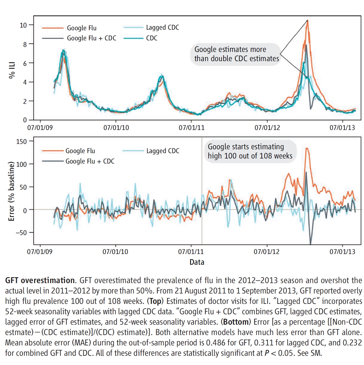
According to the authors (2014), ‘Big data hubris’ is the “often implicit assumption that big data are a substitute for, rather than a supplement to, traditional data collection and analysis”. This relates to the issue that quantity of data does not mean quality. Big data analytics fall to the concerns of measurement and construct validity issues, as well as reliability and dependency difficulties. This is essentially referring to the instruments used to measure the observations and data are not the best fit for producing the most valid and reliable data analysis and subsequent conclusion. Furthermore, Google heavily relies on algorithms to estimate future flu trends. This can be seen in the figure below. GFT overestimates the prevalence of flu during flu seasons, such as the 2012-2013 season seen in the figure. This is viewed as Google’s most common error, and as resulted in a panic instigated by the media (Lazer et al. 2014).

ii.Overfitting and overparameterization.
According to Lazer and colleagues (2014), the Google Flu Trends (GFT) of 2013 have been “persistently overestimating flu prevalence for a much longer time” than just nine years ago. This is primarily due to errors associated with not being randomly distributed; this has been an issue with Google’s flu data analysis since even the 2011-2012 flu season (Lazer et al. 2014). Errors included using “last week’s errors [to] predict this week’s errors (temporal autocorrelation), and the direction and magnitude of error varies with the time of year (seasonality)” (Lazer et al. 2014). In other words, the GFT avoids the traditional use of statistical methods by overlooking pertinent information and data. This refers back to Google’s use of algorithms and computer programs to estimate flu trends instead of depending on actual data collection. The authors (2014) conclude that although big data offer “enormous possibilities for understanding human interactions at a societal scale”, it is also important to consider “small data”, as it provides supplemental perspective to data analyses.
Part 2: Hadley Wickham’s (2019) presentation of “Data visualization and Data Science”

Link to the Video- Hadley Wickham (2019): Data Visualization and Data Science
Name the technologies/techniques Wickham introduced. What are his main points? Summarize and comment.
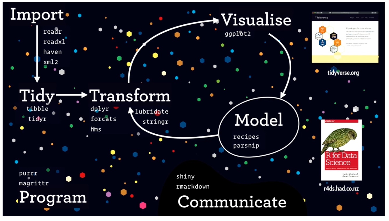
After watching this video, I was thoroughly impressed with the advancement of R Studio. Data visualization on R Studio would be so much more difficult and convoluted without the creation of the tidyverse package. This we have Hadley Wickham to thank for. Wickham is the creator of ggplot, ggplot2, and dplyr, tidyr, and purrr functions, all of which make up the package “tidyverse”. Below is a model that Wickham presented to visualize how different functions/packages are used in R Studio:

I really appreciated Wickham’s relationship of his lecture to the infamous data set “gapminder”, which is a data set describing how countries’ incomes (GDP per capita), life expectancies, and populations changed over time. They also grouped the countries by region: the Americas, Europe, Asia, and Africa. Below is the code that he used to describe the components of ggplot2 code:

Wickham emphasizes the importance of learning the language of code, so that it will become easier to construct data visualization code in R Studio. He asserts that like linguistic languages, coding is also a language that needs to be deconstructed to become fluent. The code above therefore can be read as if it says, “Read the ‘gapminder’ dataset by filtering for just data from the year 2015, and create a new variable called ‘gapminder15’”.
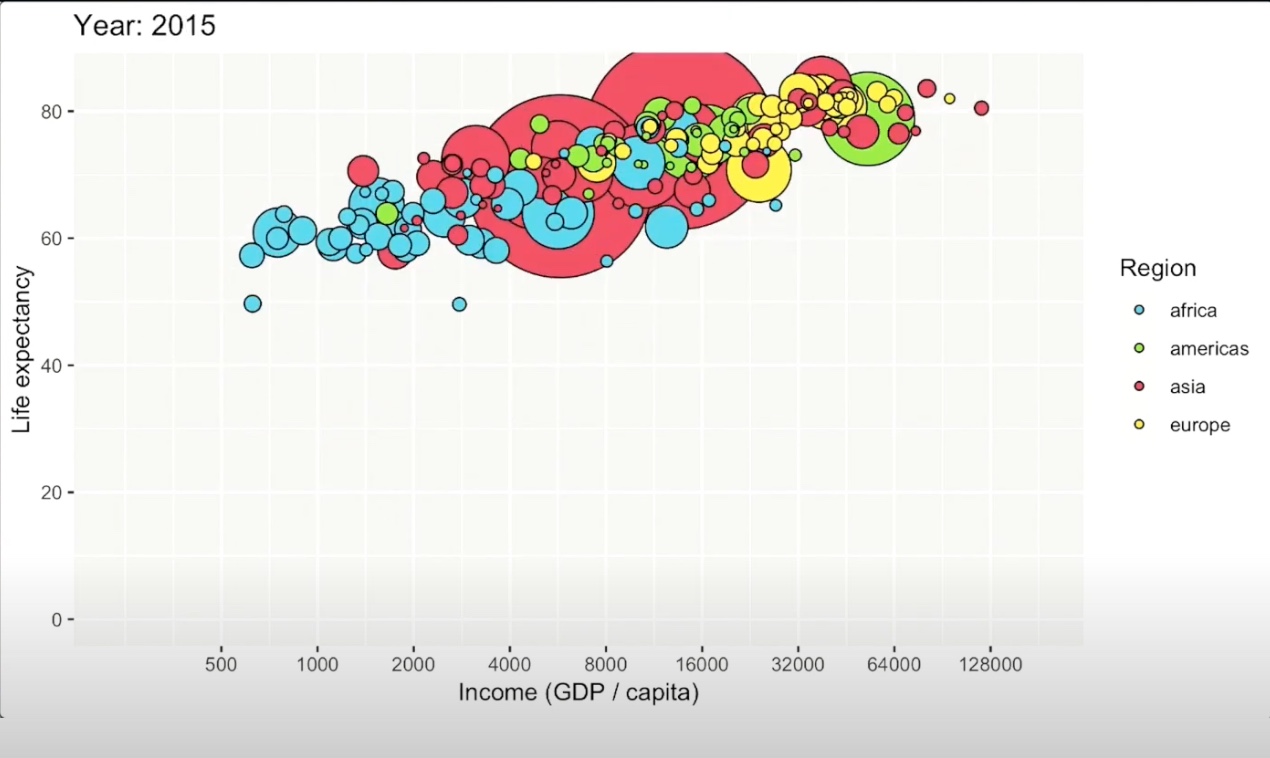
He continues to discuss the power of ‘orthogonal components’. According to Wickham (2019), orthogonal components refer to the orthogonality of a data set, or the separability of different features within a system. Wickharm asserts that we must look at data as a function, and therefore like a function, data has distinct components or variables within it. Orthogonality therefore highlights specific variables of interest or pertinence to visualize and analyze. In the ‘gapminder’ set, Wickham highlights the concept of orthogonality by generating a plot with income/GDP per capita (on the x axis) and life expectancy (on the y axis) by country and region using the tidyverse package. Below is the generated chart.

To conclude, Wickham discusses the importance and the power of code. He highlights three main advantages to code: code is text, readable, and reproducible. Because code is text, it is able to be copied and pasted. Code is also a language, which means that other people can read it as well and possibly critique and even improve your code. Finally, code is reproducible, and allows you to rerun the code with updated or changed data easily and efficiently.
All of these points that Wickham makes further emphasize how helpful coding is to visualize and subsequently analyze data, especially with the help of developed code functions and packages. For this, we really have Wickham to thank!